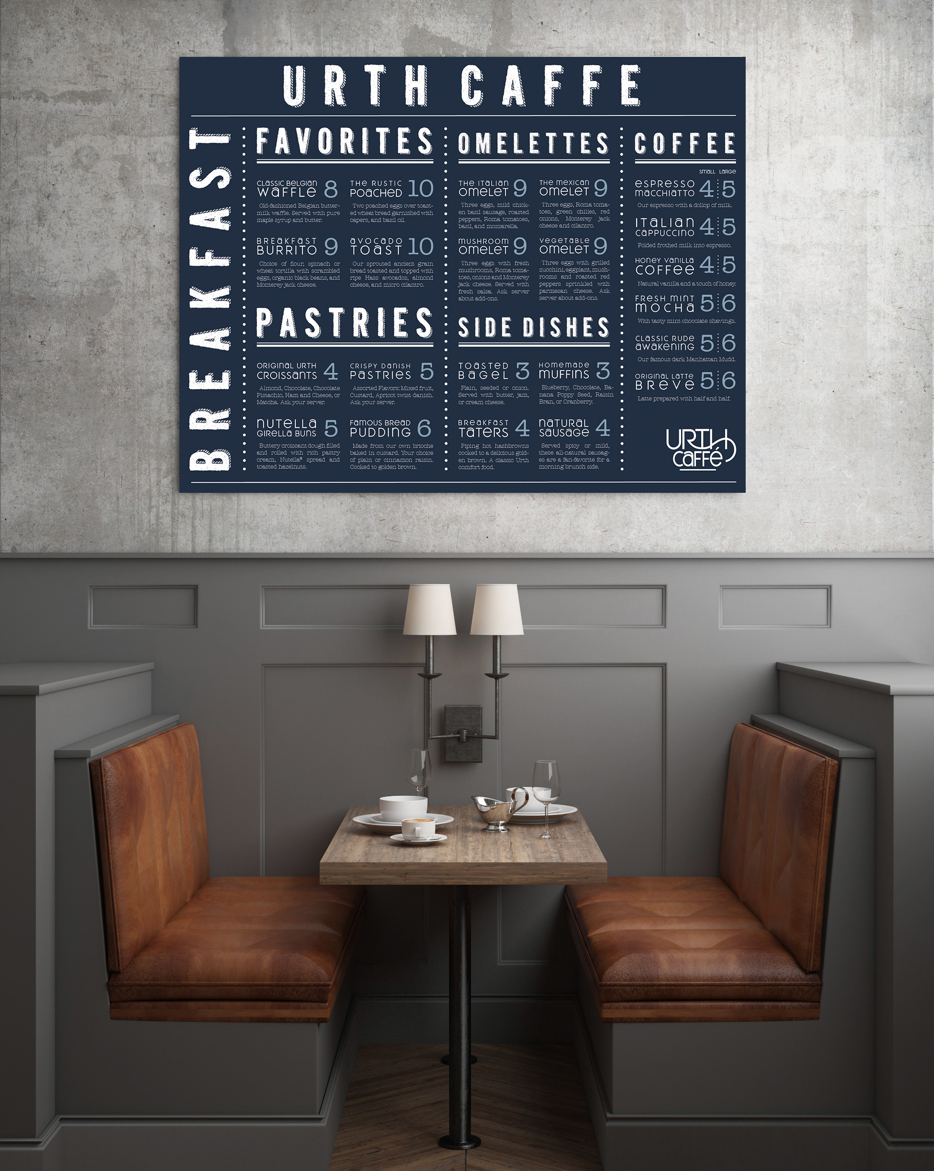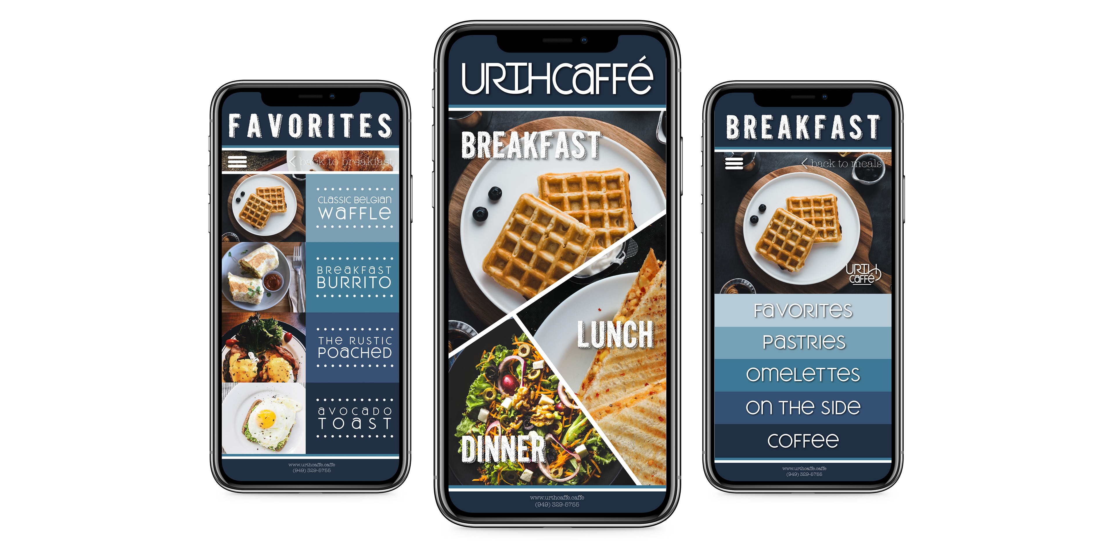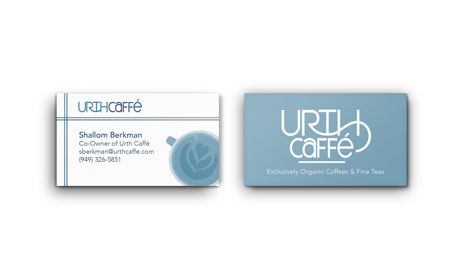
An essential marketing objective while re-designing Urth Caffé's menu and branding was to capture a balance between the eatery's two greatest values: sustainability and familiarity. A hanging board menu and app design were created to modernize this timeless restaurant. Decorative fonts Kraft Nine and Meroche are used across both print and digital menus to create cohesion and give the brand a playful, family-friendly voice. Knock-out type is used against various shades of blues to emphasize the eatery's organic and sustainable values. The logo distorts type to create the shape of a coffee mug.
*Student project, not affiliated with Urth Caffé